EditorOrchestrator class
📖 Description
The EditorOrchestrator class instance is supplied to the @editor decorated method of a NodeBlock, ConditionBlock or Collection.Item. It is used to define UI controls for editing the properties of an item. Those properties can be edited in the builder using an editor panel that is automatically generated. The EditorOrchestrator class contains methods that supply out-of-the-box components for managing often used properties, like the name, description, and alias of a block. But it also allows to add custom forms for managing properties.
The EditorOrchestrator instance is only available within the method of the NodeBlock marked with the @editor decorator. The instance is supplied as argument to that decorated method or through the editor property of the NodeBlock instance.
See the Block editor guide for more information about editor panels.
🗃️ Fields
🏷️ features
Retrieves a reference to the features of an editor panel.
Type
🏷️ groups
Retrieves the group templates with common used groups titles used in the feature list of an editor panel.
This property is only available for node blocks.
Preview
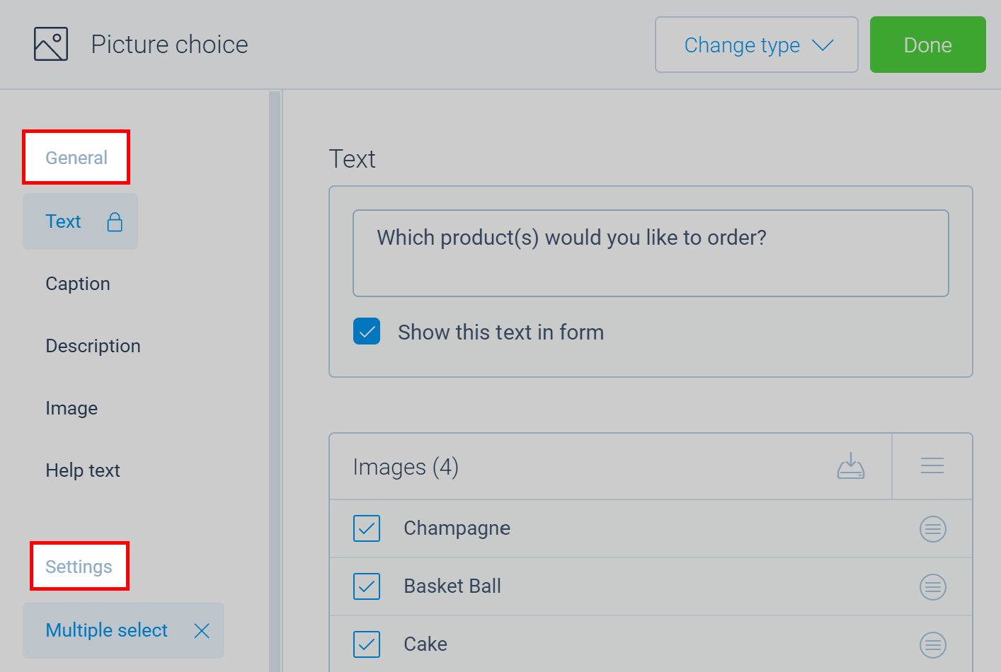
Type
{
  /* Group title for general features. */
  general: () => string,

  /* Group title for settings. */
  settings: () => string,

  /* Group title for options. */
  options: () => string,
}
🏷️ reference
Reference to the element being edited.
Type
NodeBlock | ConditionBlock | Collection.Item
▶️ Methods
🔧 alias
Adds the alias feature that manages the alias property of the supplied object.
This method is only available for node blocks.
Preview
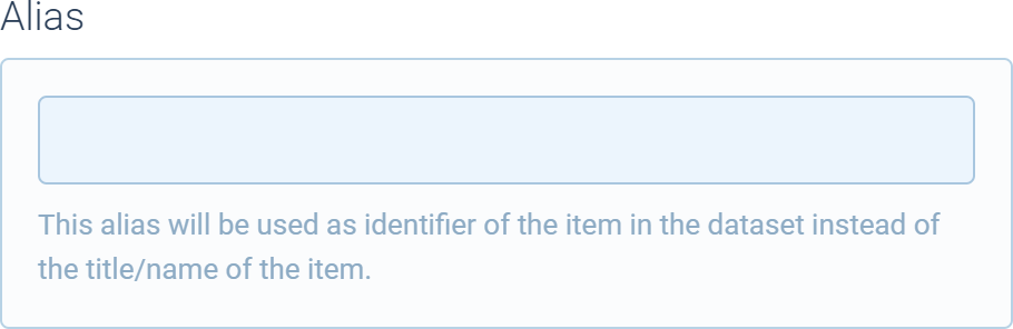
Signature
alias(
  ref: {
    alias?: string
  }
): Components.Feature
Parameters
| Name | Type | Optional | Description |
|---|---|---|---|
ref | object | No | Specifies the object with the alias property to manage. |
Return value
Returns a reference to the Components.Feature instance.
🔧 description
Adds the description feature which manages the description property of the Node.
This method is only available for node blocks.
Preview

Signature
description(
  locked?: boolean,
  label?: string,
  supportVariables: boolean | "validated" | "exclude"
): Components.Feature
Parameters
| Name | Type | Optional | Description |
|---|---|---|---|
locked | boolean | Yes | Specifies if the feature is locked (default is false). |
label | boolean | Yes | Specifies the label for the feature (default is Description). |
supportsVariables | boolean | "validated" | "exclude" | Yes | Specifies if markdown variables inside the description are supported (default is true). Can be one of the following values:- boolean: Specifies if variables are supported or not; - validated: Specifies to only include validated variables (basically these are all the variables prepending the current block);- exclude: Specifies to include all variables, except those of the current block itself. |
Return value
Returns a reference to the Components.Feature instance.
🔧 close
Closes the editor panel.
Signature
close(): boolean
Return value
Returns true if the panel was closed.
🔧 collection
Adds a collection control that can manage the items in a collection. For example, the dropdown options of a dropdown block.
Preview
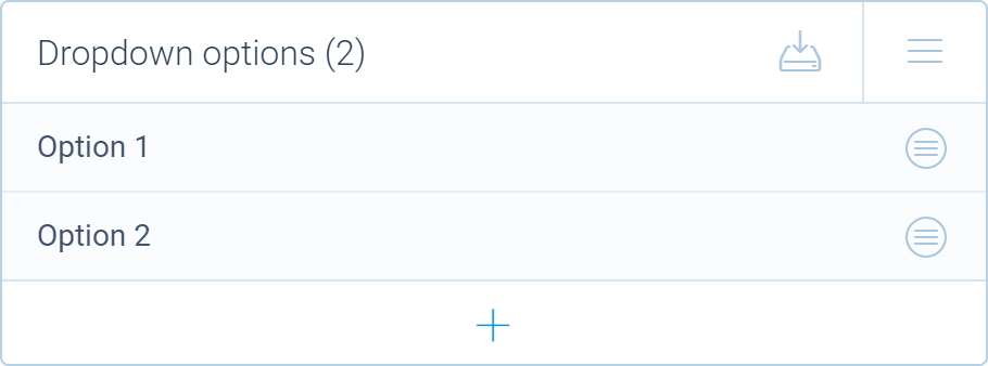
Signature
collection(properties: Collection.IProperties): Collection.Card
Parameters
| Name | Type | Optional | Description |
|---|---|---|---|
properties | Collection.IProperties | No | Specifies the collection properties. |
Return value
Returns the new Collection.Card instance.
Example
import { _, tripetto, definition, name, Collection, NodeBlock } from "@tripetto/builder";

class DropdownOption extends Collection.Item<Dropdown> {
  @definition
  @name
  name = "";
}

@tripetto({
  type: "node",
  identifier: "dropdown",
  label: "Dropdown",
  icon: "data:image/svg+xml;base64,PHN2ZyAvPg=="
})
class Dropdown extends NodeBlock {
  // This is the collection that contains the dropdown options
  options = Collection.of<DropdownOption, Dropdown>(DropdownOption, this);

  @editor
  onEdit(): void {
    this.editor.collection({
      collection: this.options,
      title: _("Dropdown options"),
      placeholder: _("Unnamed option"),
      sorting: "manual",
      editable: true,
      emptyMessage: _("Click the + button to add an option...")
    });
  }
}
🔧 explanation
Adds the explanation feature which manages the explanation property of the Node.
This method is only available for node blocks.
Preview
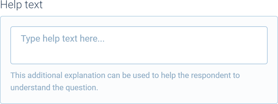
Signature
explanation(): Components.Feature
Return value
Returns a reference to the Components.Feature instance.
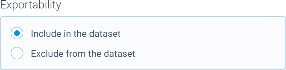
🔧 exportable
Adds the exportable feature that manages the exportable property of the supplied object.
This method is only available for node blocks.
Preview
Signature
exportable(
  ref: {
    exportable?: boolean
  },
  includedByDefault?: boolean,
  label?: string
): Components.Feature
Parameters
| Name | Type | Optional | Description |
|---|---|---|---|
ref | object | No | Specifies the object with the exportable property to manage. |
includedByDefault | boolean | Yes | Specifies if the data is exportable by default (so when this feature is unchecked, default is true). |
label | string | Yes | Specifies the label for the required checkbox. |
Return value
Returns a reference to the Components.Feature instance.
🔧 form
Adds a custom form.
Signature
form(properties: Forms.IFormProperties): Form
Parameters
| Name | Type | Optional | Description |
|---|---|---|---|
properties | Forms.IFormProperties | No | Specifies the form properties. |
Return value
Returns the new Form instance.
Example
import { tripetto, editor, NodeBlock } from "@tripetto/builder";

@tripetto({
  type: "node",
  identifier: "example-block",
  label: "Example",
  icon: "data:image/svg+xml;base64,PHN2ZyAvPg=="
})
class ExampleBlock extends NodeBlock {
  @definition
  example: boolean;

  @editor
  onEdit(): void {
    this.editor.form({
      title: "Toggle the example property",
      controls: [
        new Forms.Checkbox(
          "Example checkbox",
          Forms.Checkbox.bind(this, "example", false)
        )
      ]
    });
  }
}
🔧 group
Adds a group label in the features list.
Signature
group(label: string): Components.Feature
Parameters
| Name | Type | Optional | Description |
|---|---|---|---|
label | string | No | Specifies the group label. |
Return value
Returns a reference to the Components.Feature instance.
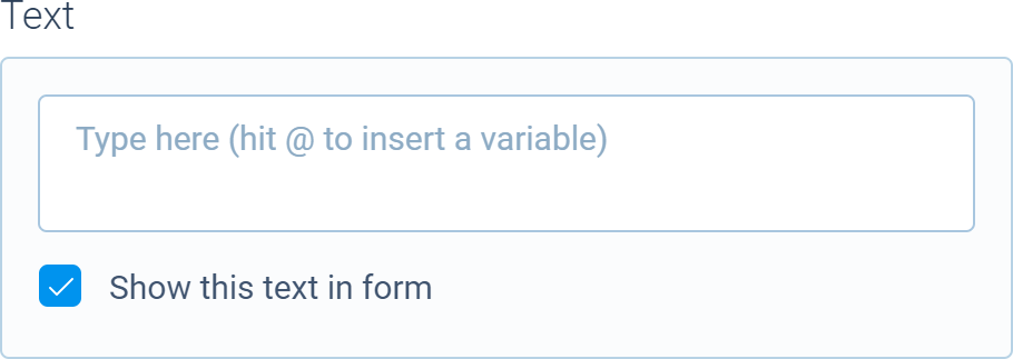
🔧 name
Adds the name feature which manages the name property of the Node.
This method is only available for node blocks.
Preview
Signature
name(
  toggle?: boolean,
  multiline?: boolean,
  label?: string,
  supportVariables: boolean | "validated" | "exclude"
): Components.Feature
Parameters
| Name | Type | Optional | Description |
|---|---|---|---|
toggle | boolean | Yes | Specifies if the name visibility can be toggled (default is true). This controls the nameVisible property of the Node. |
multiline | boolean | Yes | Specifies if multiline text is supported (default is true). |
label | boolean | Yes | Specifies the label for the feature (default is Text). |
supportsVariables | boolean | "validated" | "exclude" | Yes | Specifies if markdown variables inside the description are supported (default is true). Can be one of the following values:- boolean: Specifies if variables are supported or not; - validated: Specifies to only include validated variables (basically these are all the variables prepending the current block);- exclude: Specifies to include all variables, except those of the current block itself. |
Return value
Returns a reference to the Components.Feature instance.
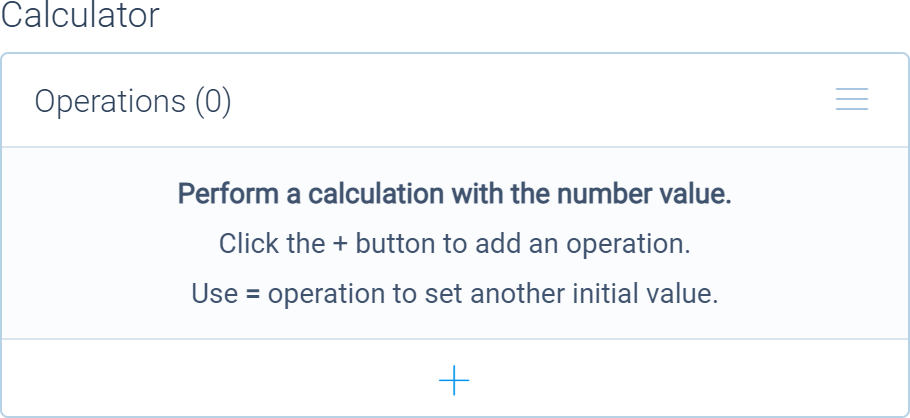
🔧 numeric
Adds a numeric feature that automatically creates a feature slot. Can be used, for example, to add a calculator feature to a block.
This method is only available for node blocks.
Preview
Signature
numeric(properties: {
  /* Reference to the target `NodeBlock`. */
  target: {
    slots: Slots;
  };

  /*Specifies the slot reference. */
  reference: string;

  /* Specifies the slot sequence number. */
  sequence?: number;

  /* Specifies the slot label. */
  label: string;

  /* Specifies the name of the feature. */
  name: string;

  /* Specifies an optional title for the feature. */
  title?: string;

  /* Optional description. */
  description?: string;

  /* Optional paired feature or card. */
  pair?: Components.Feature | Components.Card | (() => Components.Feature | Components.Card);

  /* Specifies if the slot is exportable or not (default is `false`). */
  exportable?: boolean;

  /* Specifies if the slot is protected or not (default is `true`). */
  protected?: boolean;

  /* Specifies scores to display inside the feature. */
  scores?: Forms.Numeric[];

  /* Specifies a collection that holds the scores. */
  collection?: Collection.Card;

  /* Specifies if the alias setting needs to be hidden. */
  hideAlias?: boolean;

  /* Allows to specify additional controls with custom options. */
  customOptions?: (position: "top" | "bottom") => (Control | Group)[] | undefined;

  /* Invoked when the slot has changed. */
  onChange?: (slot: NumericSlot) => void;

}): Components.Feature
Parameters
| Name | Type | Optional | Description |
|---|---|---|---|
properties | object | No | Specifies the properties for the numeric feature. |
Return value
Returns a reference to the Components.Feature instance.
Example
// Import the calculator
import { calculator } from "@tripetto/block-calculator";

// Use this code snippet to add a numeric feature with the calculator
this.editor.numeric({
  target: this,
  reference: "calculator",
  label: _("Calculation"),
  name: _("Calculator"),
  pair: this.editor.collection(calculator(this))
});
🔧 option
Adds an optional feature with a form or collection.
Signature
option(properties: {
    /* Name for the option. */
    name: string;

    /* Specifies if the option is activated. */
    activated?: boolean;

    /* Specifies if the option is visible. */
    visible?: boolean;

    /* Specifies if the option is disabled. */
    disabled?: boolean;

    /* Specifies if the option is locked. */
    locked?: boolean;

    /* Specifies a function that is invoked when the option is toggled. */
    on?: (feature: Components.Feature) => void;

    /* Specifies a function that is invoked when the option is shown or hidden. */
    onVisible?: (feature: Components.Feature) => void;

    /* Specifies a function that is invoked when the option is disabled or enabled. */
    onDisable?: (feature: Components.Feature) => void;

    /* Specifies a function that is invoked when the option is locked or unlocked. */
    onLock?: (feature: Components.Feature) => void;
  } & (
    | {
        /* Form properties in case of a form. */
        form?: Forms.IFormProperties;

      }
    | {
        /* Collection properties in case of a collection. */
        collection?: Collection.IProperties;
      }
  )
): Components.Feature
Parameters
| Name | Type | Optional | Description |
|---|---|---|---|
properties | object | No | Specifies the properties for the option. |
Return value
Returns a reference to the Components.Feature instance.
Example
import { tripetto, editor, isBoolean, NodeBlock } from "@tripetto/builder";

@tripetto({
  type: "node",
  identifier: "example-block",
  label: "Example",
  icon: "data:image/svg+xml;base64,PHN2ZyAvPg=="
})
class ExampleBlock extends NodeBlock {
  @definition
  example?: boolean;

  @editor
  onEdit(): void {
    this.editor.option({
      // The feature is activated when `example` is a valid boolean value
      activated: isBoolean(this.example),
      name: "Example feature",
      form: {
        title: "Feature for managing the optional example field",
        controls: [
          new Forms.Checkbox(
            "Example checkbox",
            // When the feature is activated and `example` is undefined, its initial value is set to `true`
            Forms.Checkbox.bind(this, "example", undefined, true)
          )
        ]
      }
    });
  }
}
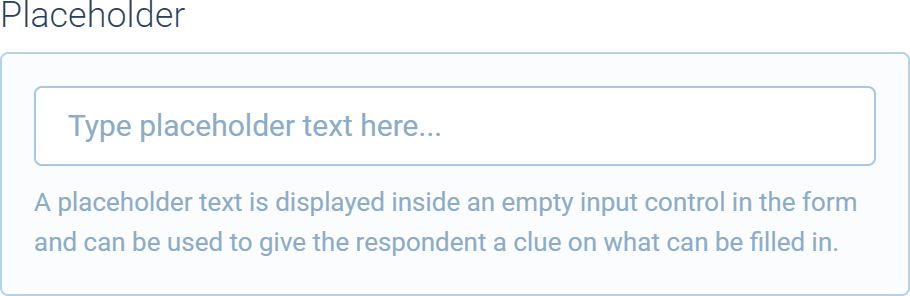
🔧 placeholder
Adds the placeholder feature which manages the placeholder property of the Node.
This method is only available for node blocks.
Preview
Signature
placeholder(...additionalPlaceholders: (Control | Group)[]): Components.Feature
Parameters
| Name | Type | Optional | Description |
|---|---|---|---|
...additionalPlaceholders | (Forms.Control | Forms.Group)[] | Yes | Specifies additional controls. |
Return value
Returns a reference to the Components.Feature instance.
🔧 required
Adds the required feature that manages the required property of the supplied object.
This method is only available for node blocks.
Preview

Signature
required(
  ref: {
    required?: boolean
  },
  label?: string,
  onChange?: (required: boolean) => void
): Components.Feature
Parameters
| Name | Type | Optional | Description |
|---|---|---|---|
ref | object | No | Specifies the object with the required property to manage. |
label | string | Yes | Specifies the label for the required checkbox. |
onChange | (required: boolean) => void | Yes | Specifies a function that is invoked when the required prop of ref has changed. |
Return value
Returns a reference to the Components.Feature instance.
🔧 scores
Adds the scores feature.
This method is only available for node blocks.
Preview
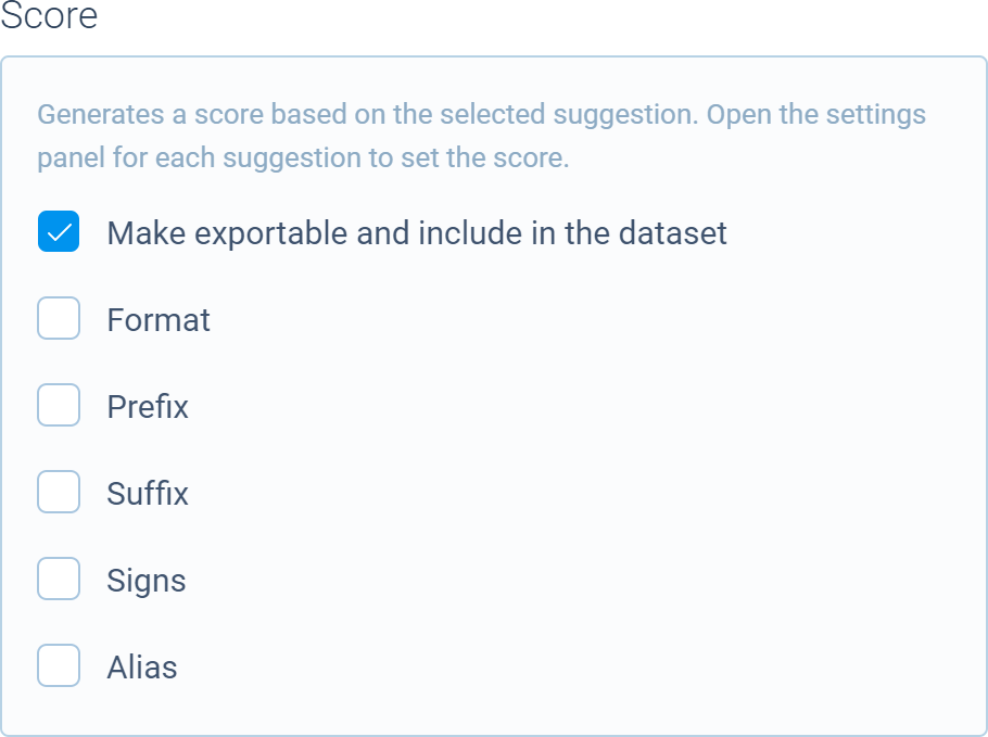
Signature
scores(properties: {
  /* Reference to the target `NodeBlock`. */
  target: {
    slots: Slots;
  };

  /* Optional description. */
  description?: string;

  /* Specifies if the score slot is exportable or not (default is `false`). */
  exportable?: boolean;

  /* Specifies if the score slot is protected or not (default is `true`). */
  protected?: boolean;

  /* Specifies scores to display inside the feature. */
  scores?: Numeric[];

  /* Specifies a collection that holds the scores. */
  collection?: Collection.Card | Components.Feature;

  /* Specifies a custom reference for the score slot. */
  reference?: string;

  /* Specifies a custom label for the score slot. */
  label?: string;

  /* Specifies the slot sequence number. */
  sequence?: number;

  /* Specifies if the alias setting needs to be hidden. */
  hideAlias?: boolean;

  /* Allows to specify additional controls with custom options. */
  customOptions?: (position: "top" | "bottom") => (Control | Group)[] | undefined;

  /* Invoked when the slot has changed. */
  onChange?: (slot?: NumericSlot) => void;
}): Components.Feature
Parameters
| Name | Type | Optional | Description |
|---|---|---|---|
properties | object | No | Specifies the properties for the scores feature. |
Return value
Returns a reference to the Components.Feature instance.
🔧 transformations
Adds the transformations feature that manages the transformation property of the supplied object.
This method is only available for node blocks.
Preview
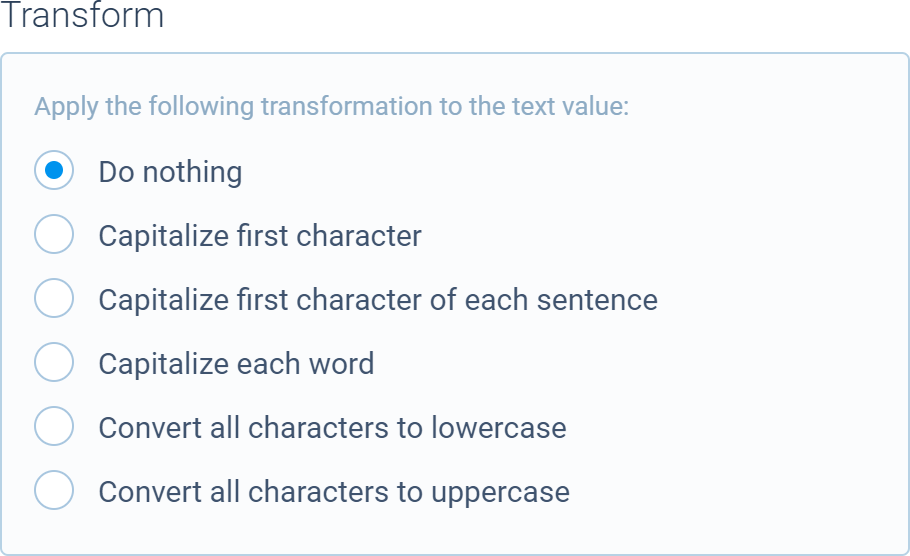
Signature
transformations(
  ref: {
    transformation?: "none" | "capitalize" | "capitalize-words" | "capitalize-sentences" | "uppercase" | "lowercase"
  }
): Components.Feature
Parameters
| Name | Type | Optional | Description |
|---|---|---|---|
ref | object | No | Specifies the object with the transformation property to manage. |
Return value
Returns a reference to the Components.Feature instance.
🔧 visibility
Adds the visibility feature which manages the disabled property of the Node.
This method is only available for node blocks.
Preview

Signature
visibility(): Components.Feature
Return value
Returns a reference to the Components.Feature instance.